accessibility & inclusive design
"
For people without disabilities, technology makes things convenient.
For people with disabilities, it makes things possible.
Judith Heumann
One of the projects closest to my heart is my effort on accessibility and inclusive design, which enables me to do my part in making our world more ethical and inclusive.
My longstanding experience with accessibility, proficiency in design principles and knowledge of front-end coding have positioned me as a leader in my organization’s accessibility efforts.
I advocate for accessibility implementation with stakeholders and leadership and have built a comprehensive training program, to empower teams to create accessible products, aligning with ethical as well as legal standards.
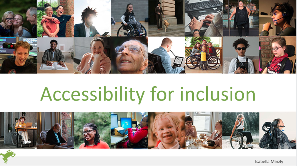
Talk "Accessibility for Inclusion"

In April 2024, I had the privilege of delivering my speech titled “Accessibility for Inclusion” to the prominent Norwegian company, Dips, which operates within the healthcare sector in Norway.
During the speech, I emphasized the significance of digital accessibility, spoke about the people who benefit and outlined the initial steps that can be taken to create more inclusive products.
It was a successful presentation, aimed at fostering greater awareness and action towards ensuring a more accessible and inclusive world.
"
Thank you, your talk was truly inspiring! Your introduction about the human aspects made us all realize that accessibility applies to and affects all of us. Moving on to guidelines, examples and direct tips was an incredibly good scheme, and I’m sure many will go back and think about how they work now.
Anca Heyd, organiser of “Inspotalks” for Dips
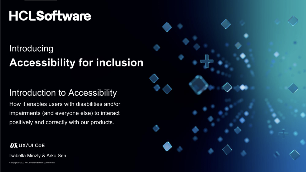
Training program "Accessibility for Inclusion"
HCLSoftware

My role
Ownership of creation of the course.
Co-delivering the course to product teams with my colleague, Arko Sen.
When
2023 – 2024

My role
Ownership of creation of the course.
Co-delivering the course to product teams with my colleague, Arko Sen.
When
2023 – 2024
I have built a comprehensive accessibility training program comprising 12 sessions, each lasting approximately 90 minutes.
Each session focuses on a specific topic such as color and contrast, covering all relevant WCAG 2.2 guidelines as well as building a profound understanding of the needs of users with disabilities, to create the high-level knowledge necessary to make the right judgement calls when implementing accessibility principles.
During each session there is also a collaborative workshop, to verify the effectiveness of the training.
In the training sessions we include designers, developers, testers and tech writers.
In specific sessions, such an the intro bootcamp and the training on how to issue a VPAT, we also include product managers and legal.
Examples of WCAG guidelines illustrated
The language of the WCAG guidelines is… not very accessible and can be hard to understand, especially to people new to accessibility.
I have created visual examples of all WCAG 2.2 guidelines with a brief explanation for people to view, while getting a more in-depth explanation in the training sessions. These images are also used in cheat sheets, and much appreciated.
And I even provide the super-star model in the pictures for no extra charge.
First steps of my accessibility journey
Bank of Italy

My role
Design and HTML/CSS
When
2009 – 2011
Collaborations & stakeholders
- Manager of the Studio Segni di Segni
- Design peers
- Managers of the Bank of Italy
- Back end engineers of the Bank of Italy

My role
Design and HTML/CSS
When
2009 – 2011
Collaborations & stakeholders
- Manager of the Studio Segni di Segni
- Design peers
- Managers of the Bank of Italy
- Back end engineers of the Bank of Italy
In 2009, following the completion of my Master’s Degree in design, I embarked on my journey into accessibility while working at the prestigious Design Studio Segni di Segni.
The Bank of Italy, admirably ahead of times in their commitment to accessibility, commissioned us with their intranet, requiring full AAA accessibility compliance.
I co-designed and took complete ownership of the HTML and CSS for both websites.
I collaborated with the engineers of the Bank of Italy, who connected the database, since all the content was for internal use only and they could not give me access.
We tested with variously users with disabilities, among whom a blind user, which was an eye opening experience which has, no doubt, contributed to shaping my further journey into accessibility.
The project was so successful that the Bank of Italy commissioned us with a second AAA accessible website the following year.
While one of these sites has since been updated, the other remains under a non-disclosure agreement (NDA).
Full discolure: It was not all fun and games
The journey into accessibility was initially incredibly challenging, marked by sleepless nights and the occasional tear of frustration, particularly due to the need to optimize for IE6.
It helped that I am a stubborn warrior, who doesn’t easily give up.
(And that I had no idea about what I was signing up for.)
In spite of having received no formal training in accessibility and my knowledge of code being at best that of a beginner, it was an amazing, eye-opening experience, especially through user testing with individuals with disbilities.
Recognizing the importance of accessible design and code and the difficulties of navigating it without proper training, I was inspired to create the training program “Accessibility for Inclusion”.
DEI: Pride in HCL
HCLSoftware
"
Equal rights for everyone doesn’t mean less rights for you.
It is not pie.
Anonimous
I am part of our Pride Group in HCLSoftware and collaborate with a fantastic group of people to create awareness of equal rights.
In 2022, for Pride Month, I wrote an article on Pride Flags and why they are important.
The article was shared internally in our organisation by our Pride Commitee, and I was rewarded a prize for it.
Article for Pride Month 2022
LGBTQ+ Pride flags, what they mean and why they are important.
A flag, I think, is about belonging, about being part of a group of people who identify in the same way, “people like me” (in my case, Danes). I never cared one bit about football, and yet it was “we” who won the European Championship in 2021 (even though I hadn’t watched a single match). Those red and white colours are “ours”.
That made me think that the intention with the different Pride flags is probably exactly this: to create symbols people can feel they belong to, colours people can identify with, a sense of “us”, “we” and “ours”. A community where I belong.
I grew up in a country where equality is deeply felt and the Copenhagen Pride is one big party: the whole city dresses up in rainbow-colours and literally everyone, from babies to grandparents, are on the streets celebrating.
A couple of years ago, during the Pride days, the cool and beautiful 13-year old of a close friend, who identifies as non-binary, explained the meaning of the many different flags to me: admittedly I was utterly ignorant and thought that the rainbow flag was the only one. I had some learning to do there.
All this to explain why I wanted to write this article about the Pride flags: we all need a sense of belonging, even more so people who are part of under-represented communities.
So let’s look into a few of the main flags. To be clear, there are many more, but in the interest of space I will only go into some of the main ones. I will, however, share a few links to articles which go into a lot more detail, for those of you who are curious to read more.

